OSEG Logo Designs
Here we list design proposals for Open Source Ecology Germany.
Discuss in the forum.
Yin/Yang with Open Hardware and Ecology
Main Idea: represent the letters OSE and add Open Hardware to the picture. O is represented by the circle. S is represented by the S in the circle - Yin/Yang is formed. The points of the Yin/Yang parts are symbols themselves. On the right is the Open Hardware logo. On the left is a symbol for Ecology. This represents the balance between technology (hardware) and nature (ecology).
Next steps could be:
- Choose good symbol for ecology: search in google images for ideas.
- Add plenty a colors for another colorful version of the logo.
- The logo can be easily upgraded for certain events: add shine, sun, animate it, etc.
Logo with Colors
OSHW-Plant
Main idea:
- To bring two main elements together: Open Source Hardware and ecology/life/growth etc.
- The reversed OSHW gear in earthy-orange represents the ground/soil as the basis for ecology/life/growth etc.
- This draft also represents the "germform"-concept (Keimform).
These drafts are in a very early stage and should only illustrate my idea. I'm not a professional illustrator :)
First Draft
Second Draft
Third Draft
Simple OSHW-Plant

 Datei:OSHW-Plant-smiple_circled_Text.svg
Updated
 SVG: Datei:OSHW-Plant-smiple_Updated_Text.svg
OSEG_RGB_wfg
OSEG_Aron
Simple OSHW-Plant Text below
 Datei:OSHW-Plant-simple Text below.svg
OSHW-Plant Symmetric
 Datei:OSHW-Plant-symmetric.svg
OSEG_Shure
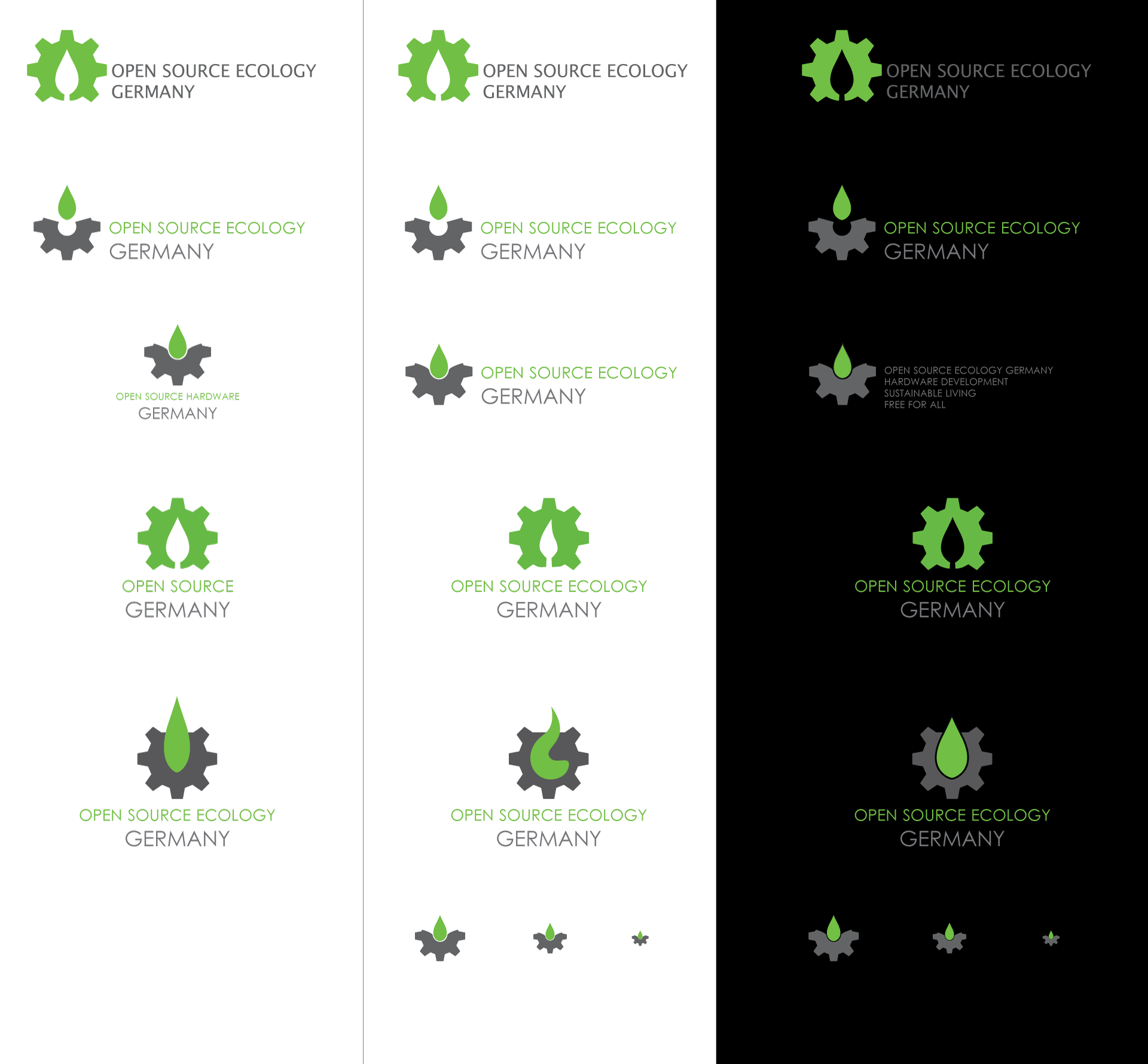 Datei:OSEG_logo_draft_shure2.svg
I like third row most, something in that direction. It's really open and not overloaded and scales fine (have look at the last row). It can be further simplified by leaving out the teeth of the sprocket at tiny sizes, that would make a nice and clear icon. --Shure (Diskussion) 19:11, 19. Jul. 2012 (CEST)

